
In this client-based academic project, I was matched with a teammate to collaboratively design a visual communication system for The Center for STEM Education (STEM Center) at the Carnegie Science Center (CSC).
How might we use visual communication design to help constituents (and/or potential constituents) of The Center for STEM Education at the Carnegie Science Center better understand STEM and the Center’s education efforts?
We were given the freedom to choose a topic from a broad selection for consideration, such as addressing what is STEM and how might it evolve, addressing how STEM fits within the greater offerings of the CSC, and etc.
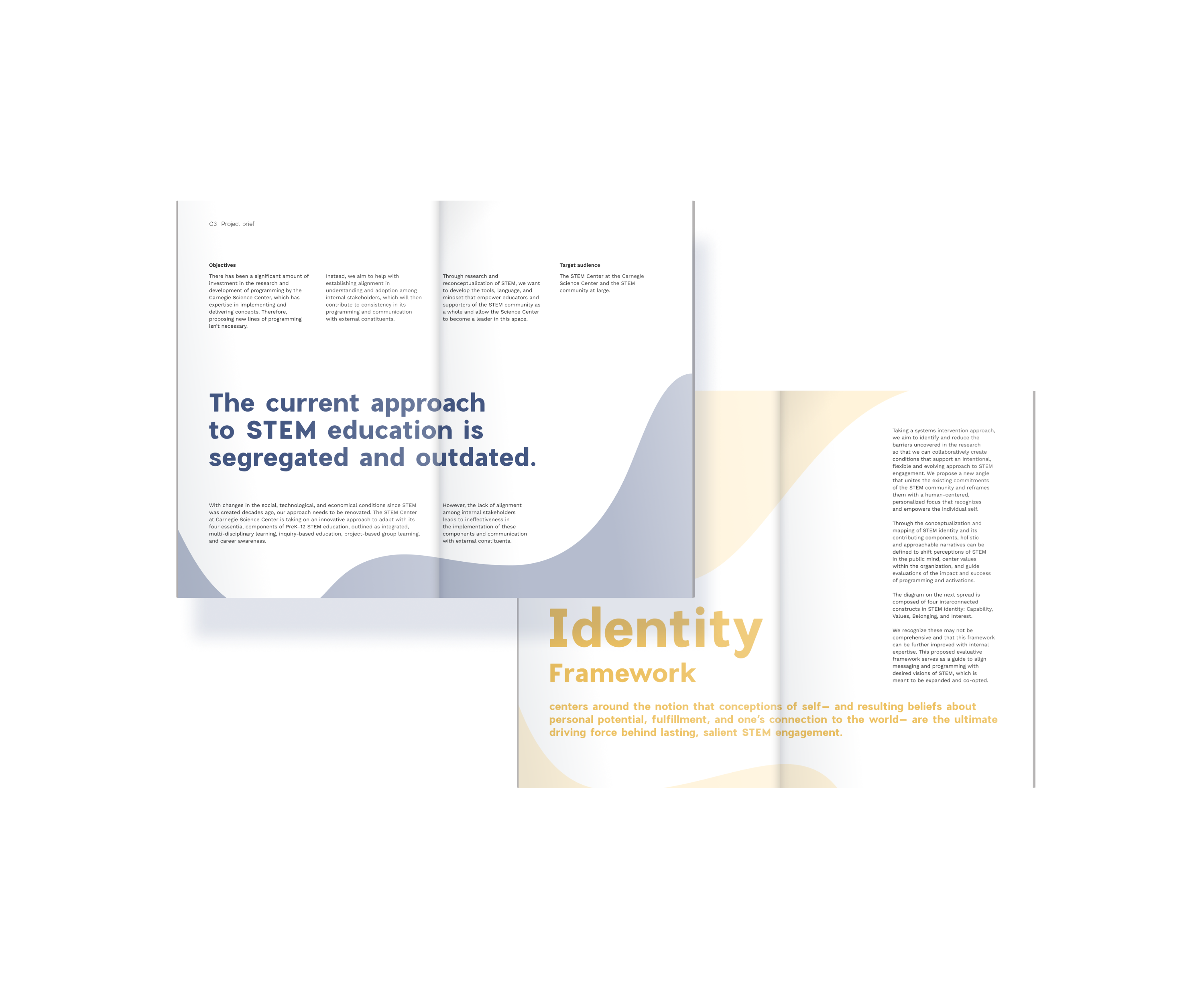
Taking STEM reconceptualization as our starting point and focus, we conducted secondary research on the STEM community and proposed a new framework that aims to help the client with establish alignment in understanding and adoption among internal stakeholders, which will then contribute to the consistency in its programming and communication with external constituents.
My partner and I worked collaboratively throughout the project and contributed equally. We frequently met to exchange ideas, work out next steps, and give/seek each other's feedback.
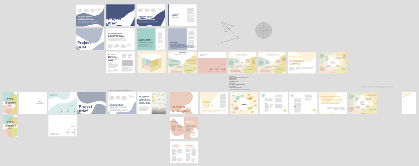
We delivered a booklet, STEM as Identity: A New Approach to STEM Engagement and Education, which documents the project background and objectives, the research and the proposed framework with an evaluative tool. The client found it very informative and inspiring.
VIEW WEBSITE LIVE
After learning about the open-ended and broad project prompt, we were both gravitating towards reframing STEM as our focus. Some of the main reasons included:
Though we lack data on current constituents and community needs, the client will always aim to expand their reach and impact. All of their programs, outreach, and activations revolve around the communication and reframing of STEM, in order to impart new values and interests in constituents.
As the client’s work revolves around crafting and sharing new STEM narratives, our work should address the conception and perception of “STEM” in order to contribute the most value to them. This allows us to think more about ideas that might relate to long-term goals, which in turn will lead to higher-level strategic efforts and engagement.
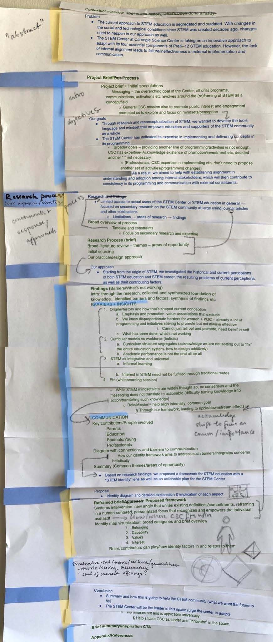
In order to come up with a direction in which we want to reframe STEM, we needed to, as a first step, identify the problem in the current conception by conducting research. We planned to start with diverging to uncover all angles in this space and then narrow back down to one specific problem space.
After a preliminary round of independent research, we drafted a work plan with initial thoughts and learnings.
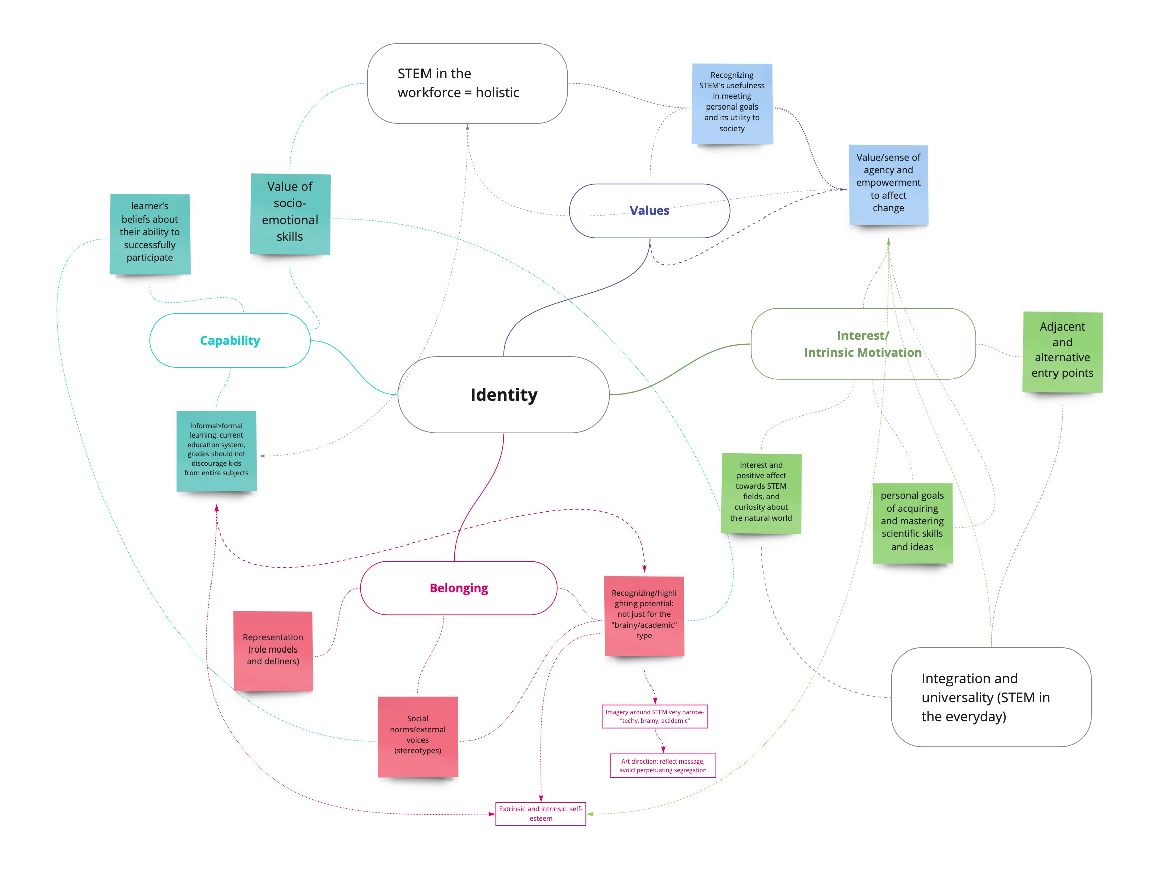
We separately conducted area-specific research and summarized key discoveries in a shared Miro board, then reconvened to discuss and organize our findings through affinity diagramming. Taking a network, systems-thinking approach, we identified defining characteristics of our intervention based on how they address present issues.
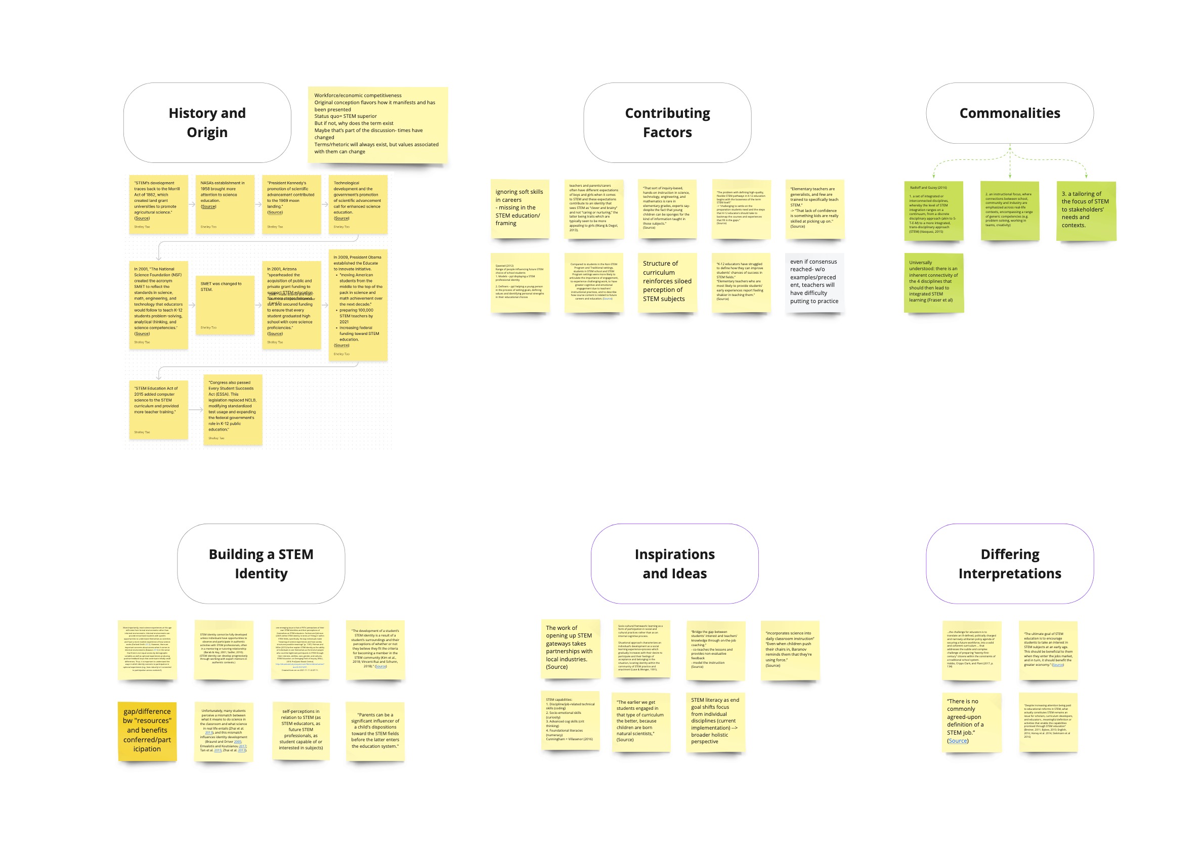
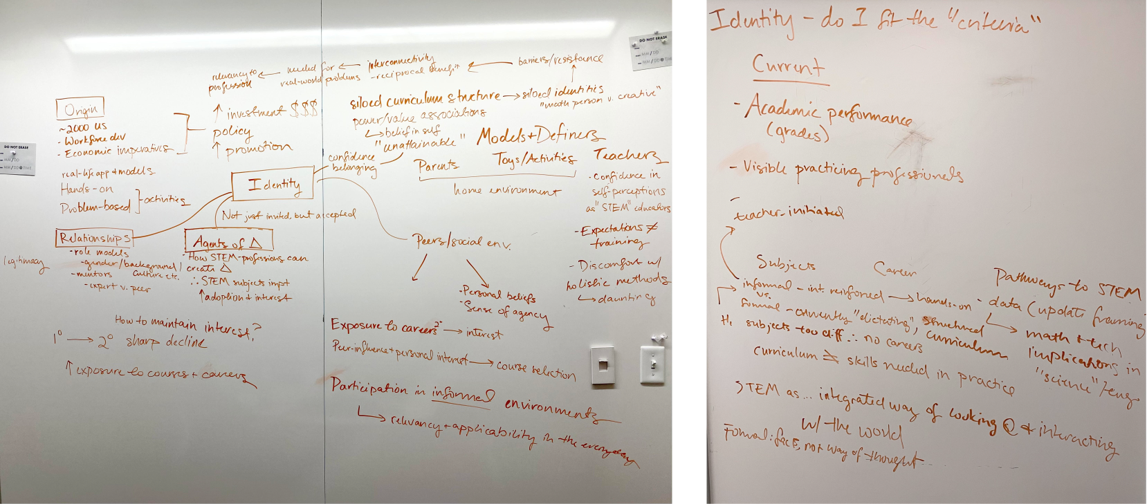
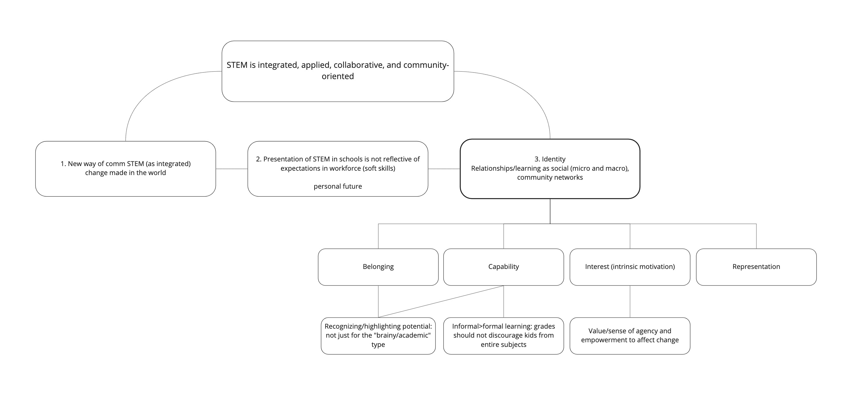
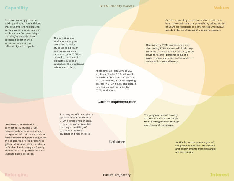
After much discussion, we realized that each ideation continued to return to the idea of STEM Identity. Four distinct constructs uncovered in our research reemerged as defining dimensions that interact in a complex and unique network to contribute to one’s STEM Identity.
With confirmed interest and affirmative feedback from Nikole, we leaned into STEM identity. We started considering how we would communicate and convince others of our proposed framework as well as whether our deliverables should communicate to internal or external constituents of the client.
Based on feedback from the instructor and our conversations with the client, the following conclusions were reached.
Deliverables should address internal alignment within the organization to center internal stakeholders on a new framework that affects STEM engagement at a higher level and helps staff communicate externally to all CSC constituents.
Reasoning: Since communicating an approach to STEM engagement is the main challenge faced by the client and their expertise lies in implementation, we will contribute more value through addressing the communication of these core components to internal audiences.
As a resource for the client, our deliverable will take the form of a robust implementation guide, as well as any related components that can be utilized independently.
Related materials may include network diagrams, research proposals, reports, visual models, and evaluative tools or activities.
Materials may include specific tools for the center that can also be utilized by the STEM community at large.

After we converged on the STEM Identity framework and what our deliverable might be like, we moved on to independently draft content summaries and contribute visual examples to a shared moodboard, and then met to discuss common directions and intent.
By merging the two content outlines, we restructured the flow and began writing the expanded copy for the deliverable.
I took on the project brief, research process, proposed framework, and evaluation of current program, while Ann wrote on findings, conclusion, and references, and rounded out existing overall copy with additional detail and edits.
Our preliminary visual direction and tone settled around the following.
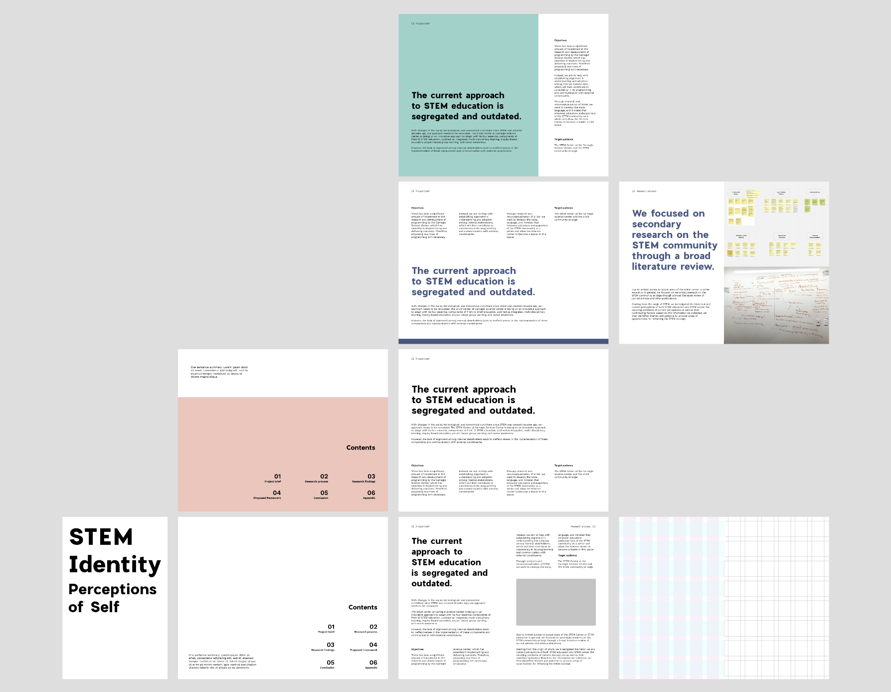
Clean, minimal layouts that convey a confident, authoritative, research-based document
An approachable and conversational tone to reflect our community-based model.
An inspiring and hopeful tone, as our intervention is framework-based and seeks to target collaborators.
In addition, we wanted to avoid perpetuating existing assumptions and connotations that live in the visual representations of STEM, which either fall into masculine tropes or lean into infantilization and “educational” themes. Therefore, we thought to combine minimalist, bold type with softer colors and delicate, organic graphics and illustrations, conveying a sense of humanity while maintaining an eye-catching, confident design.

To contribute actionable value and impact, we needed to specify what the client should be expected to do with our proposed framework and how. As such, we decided to ideate upon the idea of a rubric or evaluative tool to assess existing and future programming.
With feedback and direction from the instructor, we investigated various scoring mechanisms, tools, and models. Due to the lack of detailed program documentation from the client, we were given the go-ahead to infer and speculate upon how existing programs might map against our proposed framework as well as the hypothetical outcomes arising from the implementation of the STEM Identity framework.
To keep materials consistent and easy to reference, it became quite clear that our evaluative tool should adopt the same four dimensions that comprise our Identity Map.
The framework and the evaluative canvas act as an evolving, multidimensional model. Together they serve to guide internal decision-making and help evaluate if new initiatives are worth implementing, or existing programs worth continuing.
Before moving into a design tool with our content, we collaboratively decided on letter-sized spreads for the document and Figma as the main tool for real-time collaboration.
In terms of dividing the workload, we largely took ownership over the spreads whose content we initially wrote, and then collaboratively edited and refined everything, such as details like margins, page numbers, and graphics. In this process, we relied a lot on each other’s feedback and made sure we both were happy and consistent with the designs.
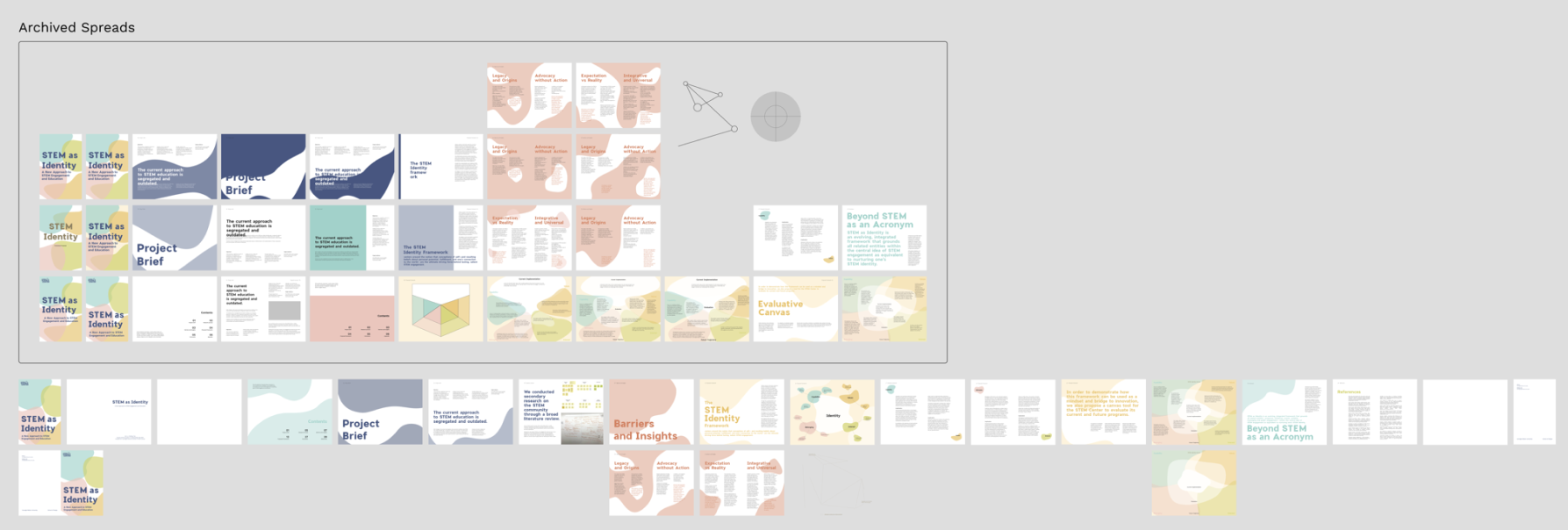
Our final step before presenting and delivering the final product was to print and assemble the booklet. Six test prints were run before final printing to help reaching desired color results, refining the layout and type sizes, and ensuring the readability of centerline-spanning text.

Our project direction to reframe STEM imposed many exciting challenges and ambiguities. It's highly conceptual and reliant on research, which seems to be distanced from the ask, visual communication system. It's also very open-ended, leaving us many decisions to make.
As a result, we spent lots of time exchanging findings and ideas, discussing next steps, and seeking feedback from the instructor, TA, and client. This process gave me invaluable opportunities to learn new concepts and methods, such as transition design framework and canvas.